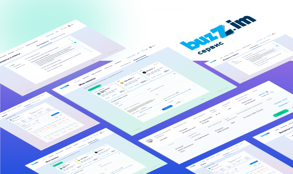
Buzz.im — a platform for posting ads in Telegram channels
The Client
Buzz.im is a platform for placing advertisement in telegram channel It is an advertising marketplace, where advertisers can find good places for theirs advertisement and telegram channel owners cna monetize their traffic.
The problem and task
The owner of the service wanted to change the design of his product as it was outdated. the main user interface — dashboard — looked like simple administrative panel, and it took a loot of time to understand how it works. People used Buzz.im service rarely.
The client has some backend developers. Therefore he needed help with design and frontend development. We had to brush up the interface, make convenient registration and authorisation process, intuitive advertiser and telegram channel owner website, develop website pages that greet visitors before they get to their dashboards.
Solution
Buzz.im service consists of content pages for everyone and dashboard for authorised users. We designed complete set of screens for desktop and mobile devices resolutions. We make page layouts and frontend programming according to the designs and business logics of the service.
Project duration
4 months
Analytics and prototypes
The main goal of interface design is making interface convenient, not beautful. So we had to find out how people search for and buy advertisement.
Our team had to walk the shoes of advertiser and telegram channel owner. We registered in the system and experienced all interaction variants user can have . These roleplays help to understand how users behave and figure out what is useful and important to them, and what is missing.
Analysis, removal of unnecessary elements is the most chalenging part of interface design, and without it any redesign has no sence.

Anastasia Kirillova
Project manager
Atwinta digital agency
We made screenshots for each step user can take and explained what is inconvenient, what can confuse user and how actions interact with each other.
The interface the service ha initially.
We created use cases map basing on those screenshots. This helped to fing and improve interface "bottlenecks" — places where user is often cofused what to do next. Then we created detailed prototypes for each segment.
Additional problems came when we understood that there is only one dashboard for both advertisers and channel owners. And it was important to make all features available on one interface But you should be sure what kind of user you are at the moment.
We added color code for users to understand — here they search advertising spaces, and here they add their channels User role is changed with tabs This also changes background color to avoid confusion.
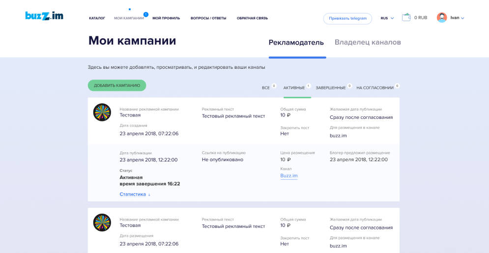
Advertiser dashboard
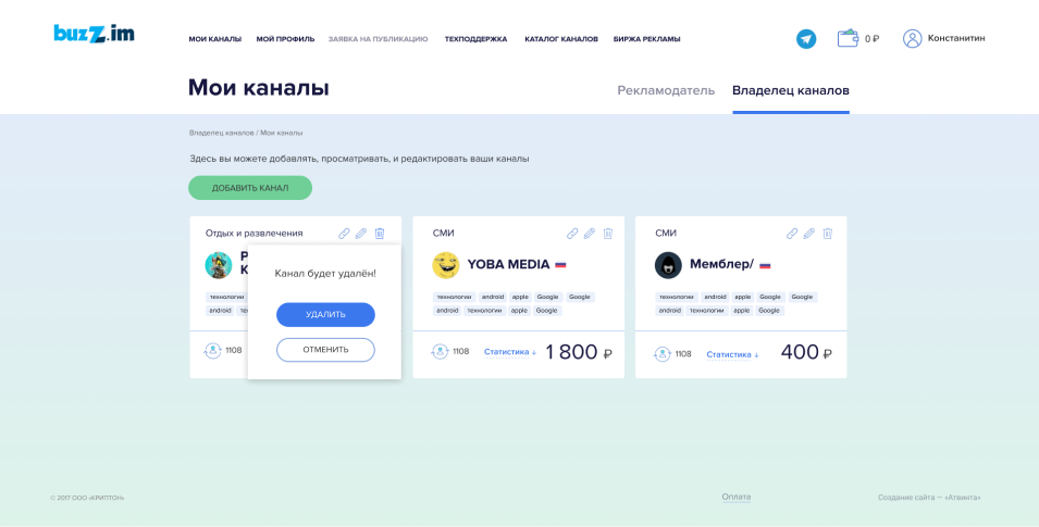
Channel owner dashboard
Some features are avilable for both advertisers and channel owners They can't be duplicated — it would make the interface unfriendly for users User adds or withdraws money from his personal account using the same instrument — wallet.
This is how prototype and final version of features shared by both users look like:
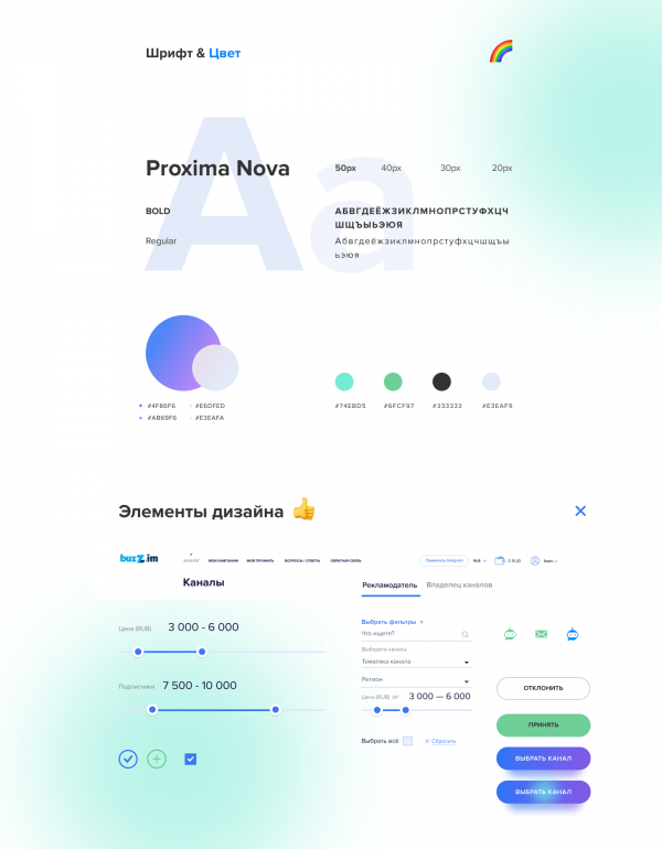
Design
We redesigned the main page, public pages of the website and user dashboards User wanted the main screen to be "catchy" and could explain the user how to use Buzz.im This goal was the main idea of our concept.
In the first concept we divided the screen into two parts: one with a phone running telegram app and a brief text block. We wanted to place little text there.
The client made it clear — his customers has a lot of questions and answering them correctly is very important. We made phone image smaller and placed it in the middle of the screen
The main goal of the main page is to attract advertisers, and they attract channel owners. We made CTA button "Buy advertisement" more noticeable.
See main page evolution from prototype to final version
We made intuitive procedure of choosing a channel We show users obly things important to them Each channel tab has the most important information to take decision: channel name, thematic, audience, price.
In addition we designed dasboards for advertiser and channel owner to make interaction with platform as easy as possible No excess features and decorations, only things users really need.
The result is minimalistic design that gives necessary information from the first page without overloading the user with unnecessary information. Design uses color scheme which associates with the messenger.
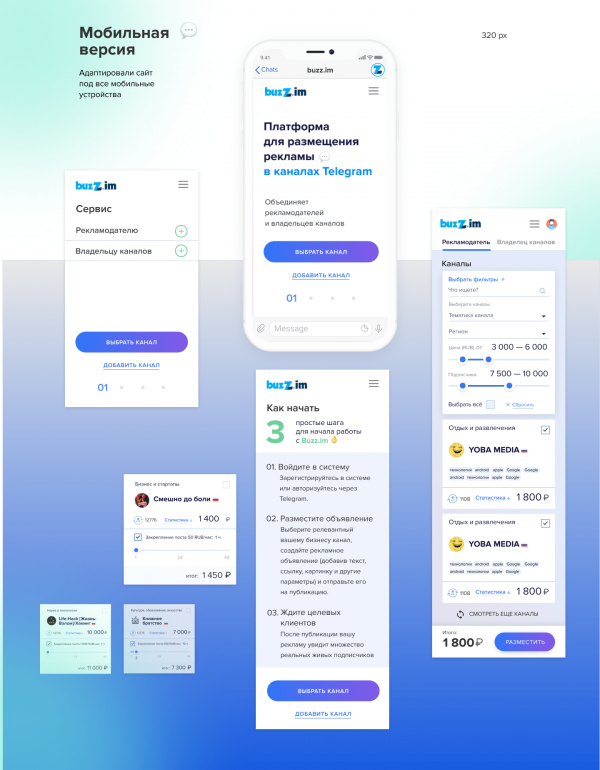
Service is adaptive to desktop and mobile browsers.
Functions
Most of the features are in user dashboard. Features are divided into two blocks one for advertisers and the other for channel owners.
Advertiser dashboard
Advertisers can browse and chose places for his advertisement, upload images for posts and tracks statistics of his activity and results of advertisement.
Channel owner dashboard
Telegram channel owner adds new channels and their descriptions, so advertisers could easily find their channel and received their revenue from advertisers with built-in financial service.
The result
Out goal was not to make the interface "easier to understand" but to make it "Possible to understand" in the first place We did our best to simplify the process of buying and selling ads in telegram And the result is a user-friendly interface which helps users instead of confusing them.

Anastasia Kirillova
Project manager
Atwinta digital agency
The service with new design is launched and works in Russian market The website is adaptive for any resolutionю
Using the website from mobile device is as convenient as from desktop.