Kemerovo Maternity Hospital website
About the project
We built a corporate website for a maternity hospital, which gives trust to the patients, tells about doctors and reveals important information for future moms.
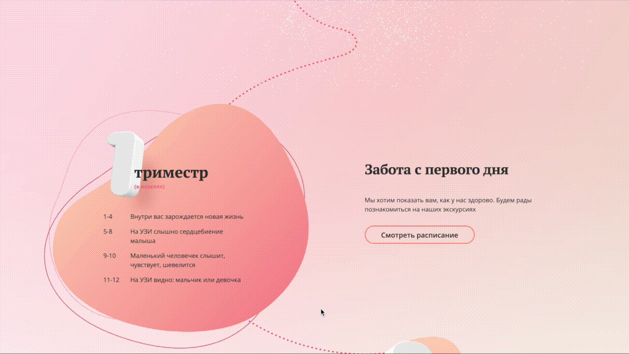
We divided the main page into three part — one for each pregnancy trimester, this guarantees that any future mom can find useful information on the main page regardless of the gestational age.
We wrote texts without any complex medical terms and told future moms everything about the maternity hospital, its' doctors and services, and what happens with a mother and child on each week of pregnancy.
- Project duration: 3 months
- Cost: 10'000 USD
- Project team: 4 designers, 2 developers, project manager, account manager, photographer, editor.
The Client
Regional Children's Clinical Hospital in Kemerovo decided to renovate the website of maternity hospital №5 which is in its structure.
The main advantage of the maternity hospital is the best equipment in the region for any situations that can occur during pregnancy and childbirth.
Hospital specialists help future mothers from the very first day of pregnancy, make the school of parenthood, help mothers and newborns in difficult pregnancy cases.
The problem and task
The maternity hospital had only a section on the website of the Children's Regional Clinical Hospital to which it relates.
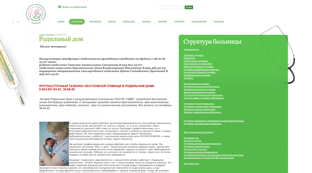
This page does not give an idea of the possibilities of the maternity hospital, does not create a feeling of caring attitude of the staff and does not position the medical institution in any way.
The head doctor contacted us for the development of a site for the maternity hospital, which tells about the medical facility and attracts patients when they just start preparing for childbirth.
Analitycs
The first stage is for understanding which information is crucial for the website and how to serve it for the target audience. We have studied websites of similar services found needs of the audience and gathered requirements of the client.
How people make websites for hospitals
We began with studying Russian and foreign websites of maternity hospitals and reproduction medical centers. Found out state requirements for websites of medical institutions in order to comply with mandatory requirements for website structure and contents.
Websites were similar to each other in structure, content, and design. The main page contained stock photos of happy children and families, pages gave little to no answers to patients' questions and services descriptions had a lot of medical terms.
We decided to take a different approach, to make a website targeted at future moms which could help them to understand what's going on with them and tell them what awaits future moms on every stage of pregnancy. And show the care of the hospital about mother and child through this.

Marina Dontsova, project manager
What was important to the client
We asked the head doctor about criteria people use to choose their maternity hospital and which criteria are used in an ideal world. I.e. we found out how the hospital positions itself at the moment and which advantages should be emphasized.
Why people choose this hospital:
Why choose the hospital:
It turned out that major part of the patients come to the maternity hospital by chance. And only a small part of the patients chose it consciously.
It meant we had to serve the information in a way it would make future parents choose the maternity house as a place to meet their baby.
What users need
We wanted to make a website which helps people to choose the right maternity house. We made a survey of women who were waiting for a baby or bore a child in the last two years.
Patients have their own opinion on how to choose where to bear a baby. Women told us that they need to be surrounded with care, comfort, and attention during pregnancy and after birth.
They used the following criteria to choose a maternity house:
- Hard good things about doctors.
- The maternity hospital has comfortable wards and good nutrition.
- The hospital is not as important as a doctor curating the pregnancy.
- The maternity house has the newest equipment and uses modern methods of childbirth assistance.
Usually, people take hospital equipment into account rarely and usually in cases of pathologies in the pregnancy period.
So we had to make the right accents on the website to meet the patients' needs and keep a balance between them and clients' requirements.
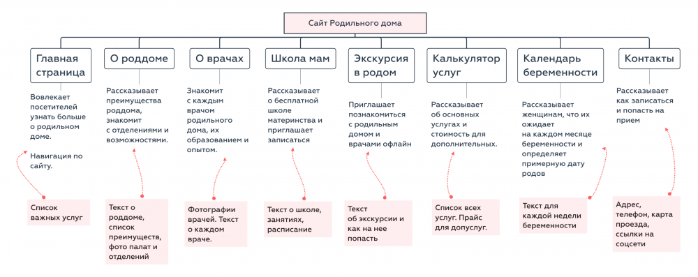
Website content structure
We analyzed interviews with the client, target audience and reference research. After the analysis, we developed a website structure describing all segments and brainstormed what should be in each segment: photos, illustrations and text.
It was important to plan content for each segment on this stage. Because it would help designers to design content blocks and their position basing on type and amount of content required on each page.
Design
There two things in corporate website design that matter:
- An idea which makes the website unique
- The information which answers user's questions — What kind of company is it, whiich problems can it solve, how to reach it?
We used the idea of a competent and caring attitude to mothers and babies as the main idea. The content of the website should help women to understand what happens while she is waiting for a baby and during the first days after the child is born.
At the beginning of the project, I was far from this theme. And I used it as an advantage: if I can understand what's written on the website, it would mean that future mothers could understand the information too. The website would be useful and interesting for them.
Alexey Nibo, art-director
The Concept
We have studied hundreds of websites together with the client during the first stage of the project. And they all were similar. That's why we set all the references aside and gathered the team to brainstorm on the question: "What symbol describes the very idea of motherhood best?".
First of all, we denied the obvious solutions like photos of families and children. This image would impose the standards of family to the visitors, while situations can be different. Especially at the maternity hospital where are women whose pregnancy and childbirth can't be called ideal. In such cases "A happy family from 80' commercials" could disappoint the patient.
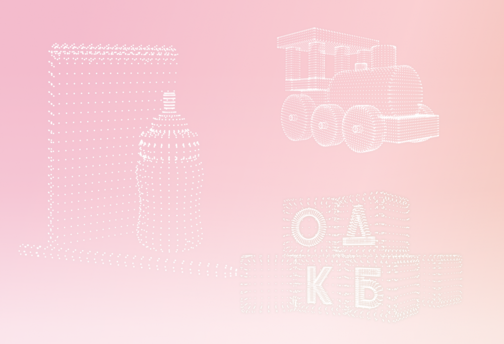
We tried to use items for children as a main idea: dummies, bottles, toys. But we denied them also as they are suitable not only to a maternity hospital but also for a kindergarten or toy shop.
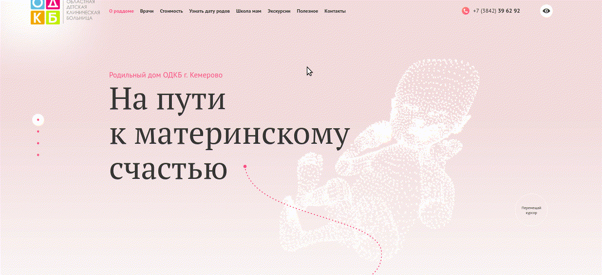
We needed to show the way in which women walks from hearing about pregnancy to meeting the baby.
Eureka, path!
That's how we made the tagline "On the way to mothers happiness" (Verbatim translation) and image of the way through the trimesters on the main page.
The cake needed its cherry. We have gone through a lot of variants of the most memorable moments during pregnancy. One of the designers remembered when she fist saw her future baby on the ultrasound scan picture.
This brought 3D graphics to the main page — particles form the shape of a baby when users hover the mouse over it.
This concept was accepted instantly.
Slider presenting doctors
After the concept we started designing the rest of the website.
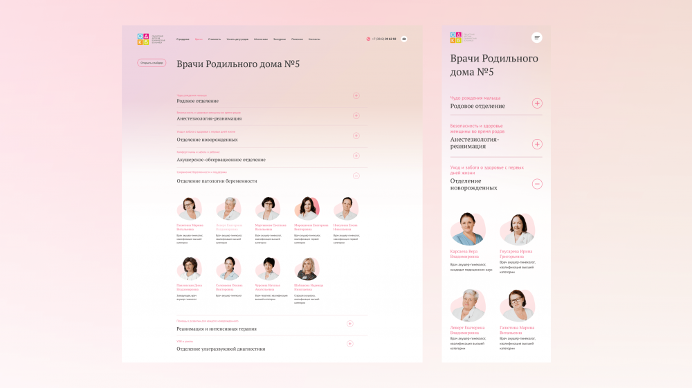
Both the Client and women we asked said that the main reason why they choose this hospital is its doctors. We had to pay extra attention to this segment. We added a slider with photos of doctors and tell about their education and experience, and to make the doctors closer to patients, we added a little bit of personal information about each of them.
We needed good photos and quotes of doctors to develop this slider. If we leave them for later part of the project, there could be some problems — photos do not fit into the design, and quotes are much bigger than the place we left for them.
First, we asked the client to send photos of doctors and a prepared questionnaire of five questions. The questionnaire asked how they got into the profession, what is the most interesting in their work, and what is the most difficult.
But it turned out that some of the doctors don't have photos in the appropriate quality, and those that are, it is difficult to fit in the desired format and size. And all 60 questionnaires returned with almost identical and formal answers to all questions.
Solution: Photograph and interview the doctors ourselves.
We took all the necessary equipment, came to the hospital and made a photosession. The editor was interviewing the doctors as the photographer was doing his job.
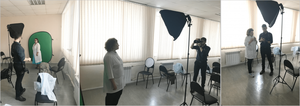
The personal conversation always helps to uncover a person, helps to understand what makes them tick. You only need to overcome the initial resistance and show interest in the person and their job. The result of the interview is the quotes of each doctor that translate their love to their job.
Elena Nikulina, Editor
We prepared the photos. Chose the most interesting phrases from interviews. And made a slider which personally introduces each doctor. The page of each doctor could be opened in a separate window for means of SEO.
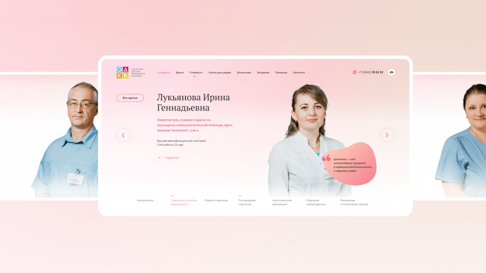
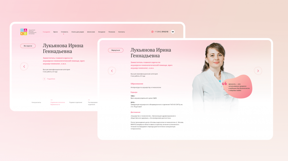
For mobile version, the slider is replaced with a list divided into different branches of the hospital. This list can be accessed by pressing the "see all" button in the desktop version of the website if you need to find a specific specialist quickly.
Information pages
The sections "About the maternity hospital", "Excursions" and "Childbirth Classes" are sections where users come to find answers to their questions. The content and its presentation is part and parcel of such pages.
The customer did not have ready-made texts and descriptions, it was necessary to either wait or do this part of the work ourselves. We chose the second option: we wrote all the texts on the site ourselves and based on the story of the head doctor and interviews with women.
As we knew from surveys, future mothers are primarily concerned about the health and comfort of the baby, and not the regalia and equipment of the maternity hospital. While doctors and medical staff stated that health and safety are reached exactly by doctors qualifications, their attitude to their job and equipment they have.
We fully described all the possibilities of the maternity hospital. We delicately told about equipment for complex cases of pregnancy and childbirth, added photos of the wards and departments.
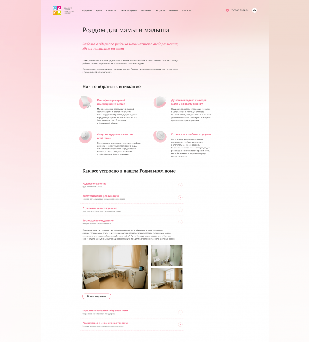
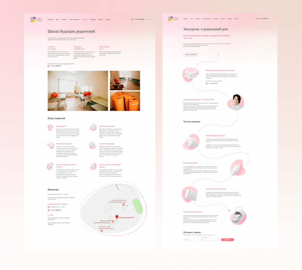
In the "Childbirth Classes" we told about how classes are held, how to sign up, showed room for lessons. Added a description of the lessons, like in a real school.
We used the metaphor of path again in the "Excursions" page for the presentation of information. We told what people can find during the excursion. We added the sign-up by phone” button to make it convenient for visitors to sign up for an excursion from this page.
Pregnancy calendar and birth calculator
These are interactive pages that tell user information based on their actions.
The pregnancy calendar allows you to determine the approximate date of birth and find out what happens to the woman and her baby in each week of pregnancy.
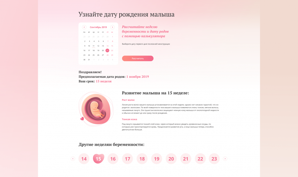
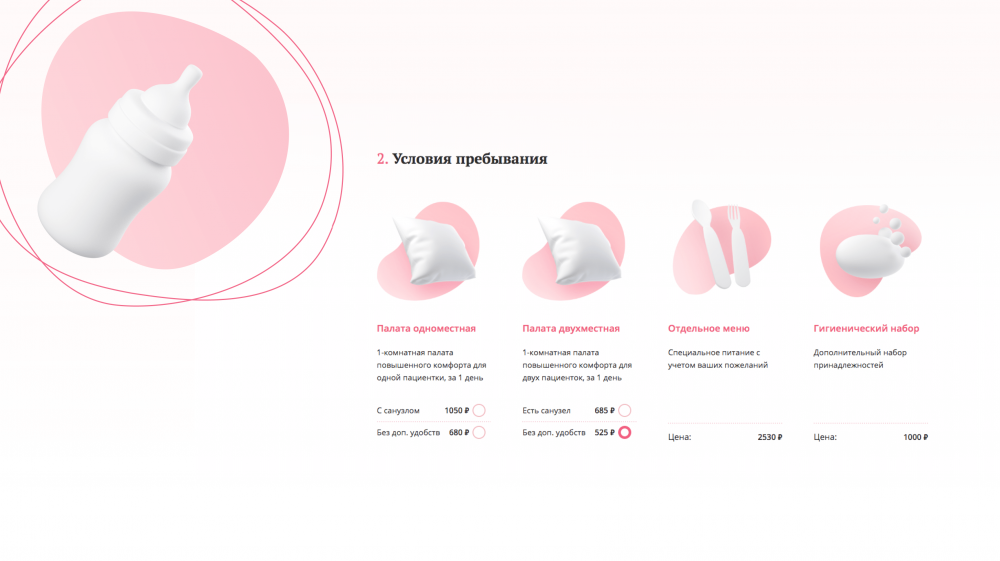
“Birth Calculator” is the “Pricing” section of the main menu.
In the maternity hospital, you can get services for free, and you can order additional options. For example, a separate room, a special menu or order a photographer and flowers when a mom and newborn leave the hospital. The section will orient the future mother in advance what may be needed in addition to the basic services, and how much it will cost.
We developed 3D icons to visually emphasize each service.
UI-kits
Drawing a unique and elaborate design is not enough. It has to be coded into pages without losing anything. It is an impossible task without the UI kit and teamwork of designers and front-end developers.
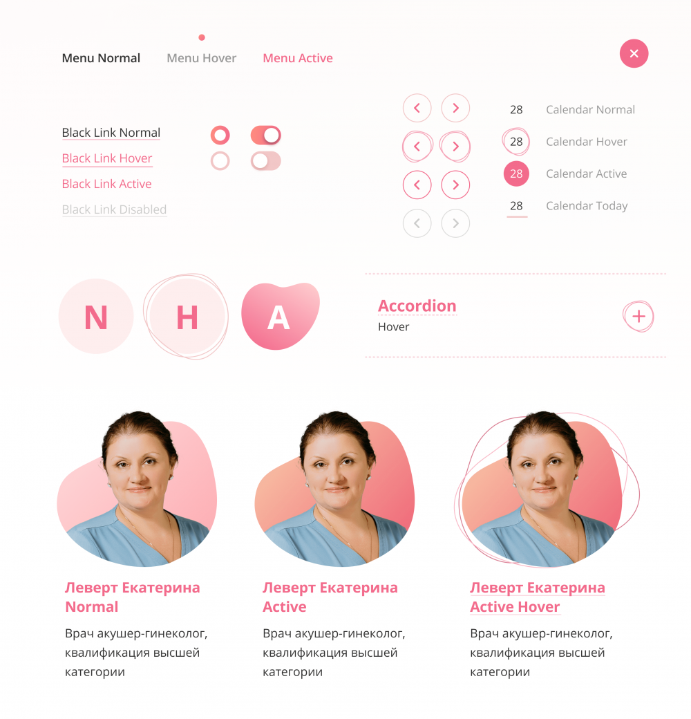
Designers prepared both classic UI kit and its interactive version for this project. The motion video showed how the elements should react so that the developers correctly convey the animation.
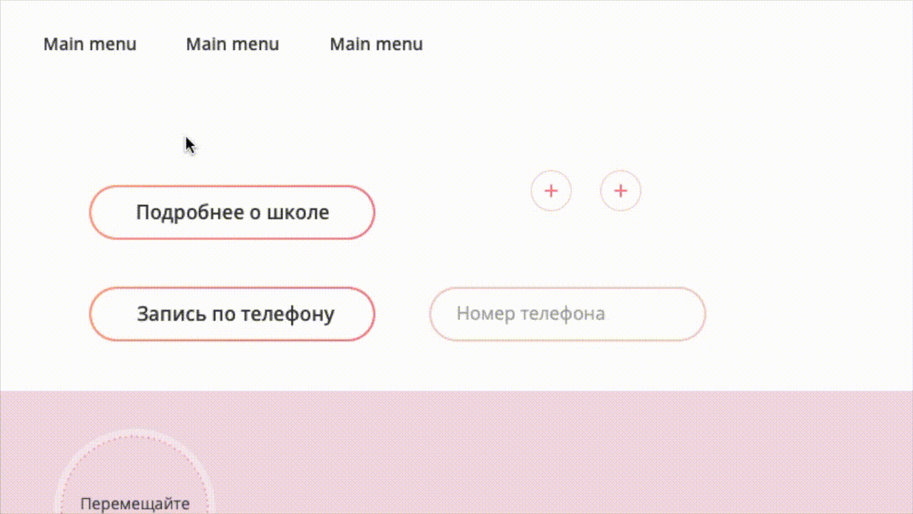 Part of interactive UI kit
Development
The hardest part of website design is to code the design into pages correctly and make the site work quickly on any device.
Designers tested each element for feasibility when they were making the website design.
We consulted with developers and looked in CodePen, to estimate the difficulty of making what we have drawn. And only then added the element to our design.
Alexey Nibo, art-director
For example, animated tabs on the main page expand and change form when the mouse hovers over them. It was necessary to make sure that when turning one form into another, the animation worked out correctly and kept the right gradient.
Frontend-developers and designers were making the animation frame-by-frame.
How it shouldn't work:
Final result of hard work.
The website is adaptive for phones and tablets. We took into account possible Internet restrictions on these devices and abandoned the animation on the main page in the mobile version.
In the section with doctors on these devices, we disabled the slider and used a section with a list of doctors. It was much more convenient for a small screen — no need to adjust the amount of text to show the doctor page nicely.
We configured the ability to change the content on the pages in the administrative panel of the site, w. For example, add a new employee to the section about doctors, change the information in the "Excursions" or "School of Moms" sections, add or remove services in the "Pricing" section.
Result
The result was a sincere corporate website of the Kemerovo maternity hospital, which reinforces confidence in the maternity hospital, conveys an atmosphere of care and helps expectant mothers to choose a place where they will meet with their child.
The main page focuses on services which must be presented to the patients. This is done without any abuse, taking care of patients needs and interests.
The design and content of the site form the desired image of the hospital for visitors and answer important questions from patients. Future mothers find useful information on pregnancy, childbirth and the maternity hospital on the site, and the maternity hospital presents its strengths and receives new patients.
Such websites are only possible when the client trusts agency experience completely.